Fonts
The following fonts are recommended for use in print and on the web.
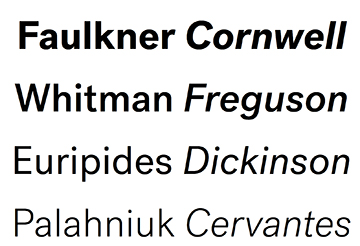
Post Grotesk
Josh Finklea began work on Post Grotesk in 2011 with the goal of designing a contemporary version of the traditional grotesk sans-serif for his own use. The intention was to build an amiable typeface with maximum usability and an overall sense of neutrality.
Post Grotesk is versitile and can be used as body text or header text.
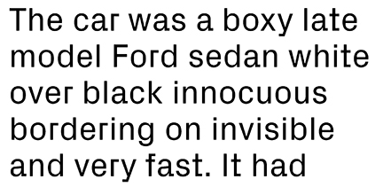
PX Grotesk
Px Grotesk is designed after the rendering of typographic curves on screens. At smaller sizes, pixels sometimes simplify the shapes brutally. From this antagonism, Nicolas Eigenheer has designed a typeface that embeds the screen parameters into a classic linear drawing. The result is hybrid as the shapes combine formal solutions from the pixel grid and a linear drawing. The font works both for screen and print use, and its geometrical simplification offers a spectacular legibility and sharpness at small sizes. At bigger sizes, it reveals a sophisticated drawing and an unprecedented aesthetic for a classic grotesque.
We are recommending that Px Grotesk be used for headlines and anywhere a more distinctive typeface is needed.
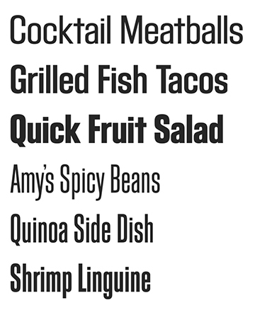
Block Gothic
Block Gothic was designed in 1992 as a primarily condensed and compressed typeface. This font is well suited for use in print and web design uses such as posters, brochures, invitations, social media graphics.
Alternative Font: Arial
If the fonts listed above are not available, you may use the sans serif font Arial.