News
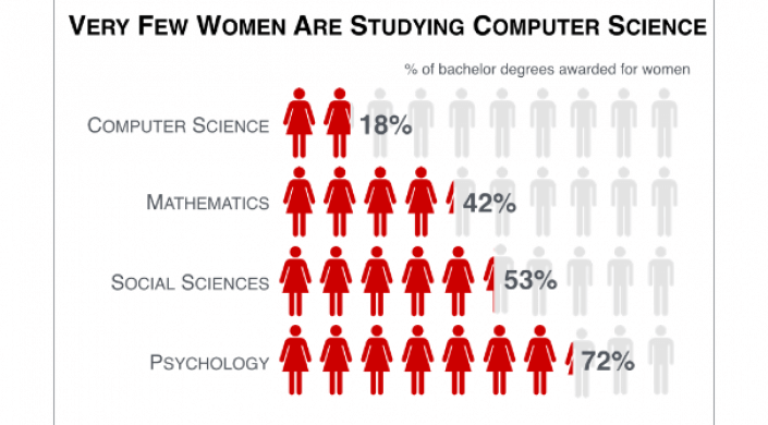
The study’s results suggest that pictograms, often ridiculed for “dumbing down” complex topics, do not negatively affect memorability and, when employed appropriately, can dramatically improve information recall. Figure by Nam Wook Kim, Harvard graduate student.
Spend 10 minutes on social media, and you’ll learn that people love infographics. But why, exactly, do we gravitate towards articles with titles like “24 Diagrams to Help You Eat Healthier” and “All You Need To Know About Beer In One Chart”? Do they actually serve their purpose of not only being memorable, but actually helping us comprehend and retain information?
Researchers from the Harvard John A. Paulson School of Engineering and Applied Sciences (SEAS) and MIT’s Computer Science and Artificial Intelligence Laboratory (CSAIL) and are on the case.
In a new study that analyzes people’s eye movements as they look at charts, graphs and infographics, researchers have been able to determine which aspects of visualizations make them memorable, understandable and informative. The findings reveal how to make sure your own graphics really pop.
Presenting a paper last week at the proceedings for the IEEE Information Visualization Conference (InfoViz) in Chicago, the researchers say that their findings can provide better design principles for communications in industries like marketing, business and education, as well as teach us more about how human memory, attention, and comprehension work.
“By integrating multiple methods, including eye-tracking, text recall, and memory tests, we were able to develop what is, to our knowledge, the largest and most comprehensive user study to date on visualizations,” says CSAIL PhD Zoya Bylinskii, first-author on the paper alongside former SEAS doctoral student Michelle Borkin, who is now an assistant professor at Northeastern University.
The paper’s other co-authors include Harvard graduate student Nam Wook Kim; former Harvard undergraduate Chelsea S. Yeh and research intern Daniel Borkin; Hanspeter Pfister, An Wang Professor of Computer Science and Borkin’s former advisor and Kim's current advisor at SEAS; MIT Professor Aude Oliva; and CSAIL research assistant Constance May Bainbridge.
Pfister, Oliva and Michelle Borkin collaborated on related research, also presented at InfoViz, in 2013.
Among the top tips for aspiring data-viz designers:
Make your title count
While the “visuals” in your visualization are clearly important, people actually spend the most time on the text – and, above all, your title.
The study found that the strongest visualizations have titles that use concise, descriptive language to sum up the take-away message.
“People often include titles that don’t add much to what is already shown,” says
Jean-Luc Duomont, a scholar of scientific communication and author of the seminal visualizations book “Trees, Maps & Theorems.” “If a chart’s axes are labeled ‘temperature’ and ‘time,’ then ‘the evolution of temperature over time’ is much less meaningful than, for example, ‘temperature increased much faster than anticipated.’”
Pictures are worth more than a few words
Of course, being too text-heavy would defeat the entire purpose of the medium. Pictures and graphics give readers additional associations that help them retain and recall the content.
Specifically, the study’s results suggest that pictograms, often ridiculed for “dumbing down” complex topics, do not negatively affect memorability and, when employed appropriately, can dramatically improve information recall.
Repeat, repeat, repeat
As any marketing expert can tell you, repetition is crucial to getting your message across.
Strong visualizations provide multiple ways of conveying and labeling information.
For example, if you want to emphasize differences between a series of numbers, it may be helpful to actually spell out the exact number, or add proportionally-sized bubbles that give the viewer a sense of scale.
All of these strategies increase your content’s “redundancy” and make viewers more likely to remember both the data and the larger message.
Doumont says that the team’s conclusions align with many accepted guidelines in the visualization community.
“Studies like these are reassuring, in serving as empirical proof of why these ideas are so effective,” he says.
How the researchers did it
The team analyzed subjects’ eye movements, memory performances, and textual responses as they looked at a collection of nearly 400 distinct visualizations taken from newspapers, blogs, scientific journals and government reports.
Participants were first shown each visualization for 10 seconds, and then given a memory test to determine which ones they recognized. During these “encoding” and “recognition” phases, the researchers simultaneously collected data on eye fixations to help determine which elements of the visualizations were helping the subjects recall information.
Importantly, the team then showed participants blurred versions of the original visualizations and asked them to write down everything they remembered about each of them.
“A key insight was to break memory down into these three core cognitive principles of encoding, recognition, and recall,” Borkin says. “This allowed us to tease apart what it is that makes a given visualization not just more memorable than another, but also what a reader can actively recall in detail, which is a much more accurate measure of its effectiveness.”
Borkin says the team is also releasing MassVis, the first open-source visualization database of its kind, to let others build on top of their work. The dataset includes thousands of intricately-labeled visualizations, with metadata that includes memorability scores, eye movements, and user-generated descriptions.
The team is now working to further disentangle the different ways to define and measure memorability, as well as exploring how their conclusions can be applied to larger groups and people with specific areas of expertise.
Cutting-edge science delivered direct to your inbox.
Join the Harvard SEAS mailing list.
Scientist Profiles

Hanspeter Pfister
An Wang Professor of Computer Science
Press Contact
Leah Burrows | 617-496-1351 | lburrows@seas.harvard.edu